30% Order Time Lost to Lines & Errors

Traditional counter ordering: Long lines + manual entry = 30% longer order times
SkyTab merchants lacked modern self-ordering, forcing customers to queue and rely on staff-entered orders. Result: bottlenecks, accuracy issues, and payment friction.
Efficiency
Long lines during peak hours hurt satisfaction and turnover
Accuracy
Staff miscommunication = wrong orders + food waste
Flexibility
Limited payment options created checkout friction
Key Insights
- Speed > features: Merchants needed faster throughput. Every extra screen = friction.
- Visual-first ordering: Food photos drive decisions—text descriptions don't.
- Loyalty is critical: Repeat customers expect seamless rewards integration.
- Payment flexibility: Some prefer kiosk payment, others want to pay at counter.
- Hardware matters: 15" touch requires 44pt+ targets and standing-height UX.
Minimal Screens, Maximum Clarity
Design Principles
Minimal Screens, Maximum Clarity
One purpose per screen. Essential information only.
Touch-First
Design
Large 44pt+ targets with visual feedback and forgiving hit areas.
Visual Hierarchy = Speed
Primary actions are most prominent. Size and color guide users.
Fail
Gracefully
Clear error recovery paths with no dead ends for users.
From Research to Prototype
Phase 1: User Flow Mapping
Mapped out the key user journeys, ensuring a straightforward and intuitive process from welcome to order completion.
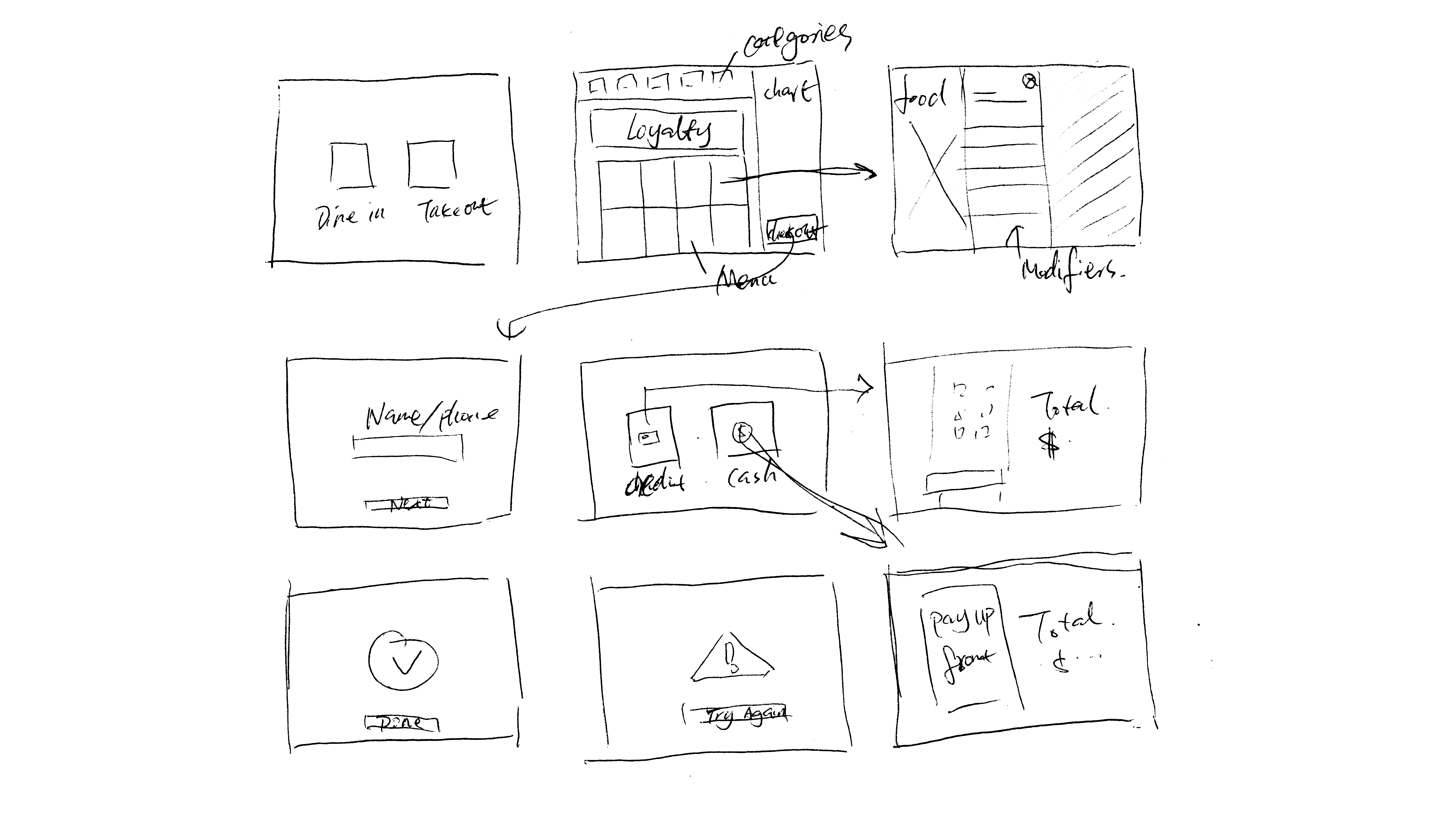
Phase 2: Wireframing & Concept Testing
Created initial wireframes that simplified the user interface, focusing on minimal screens and taps for faster order completion.
Key decisions from wireframing:
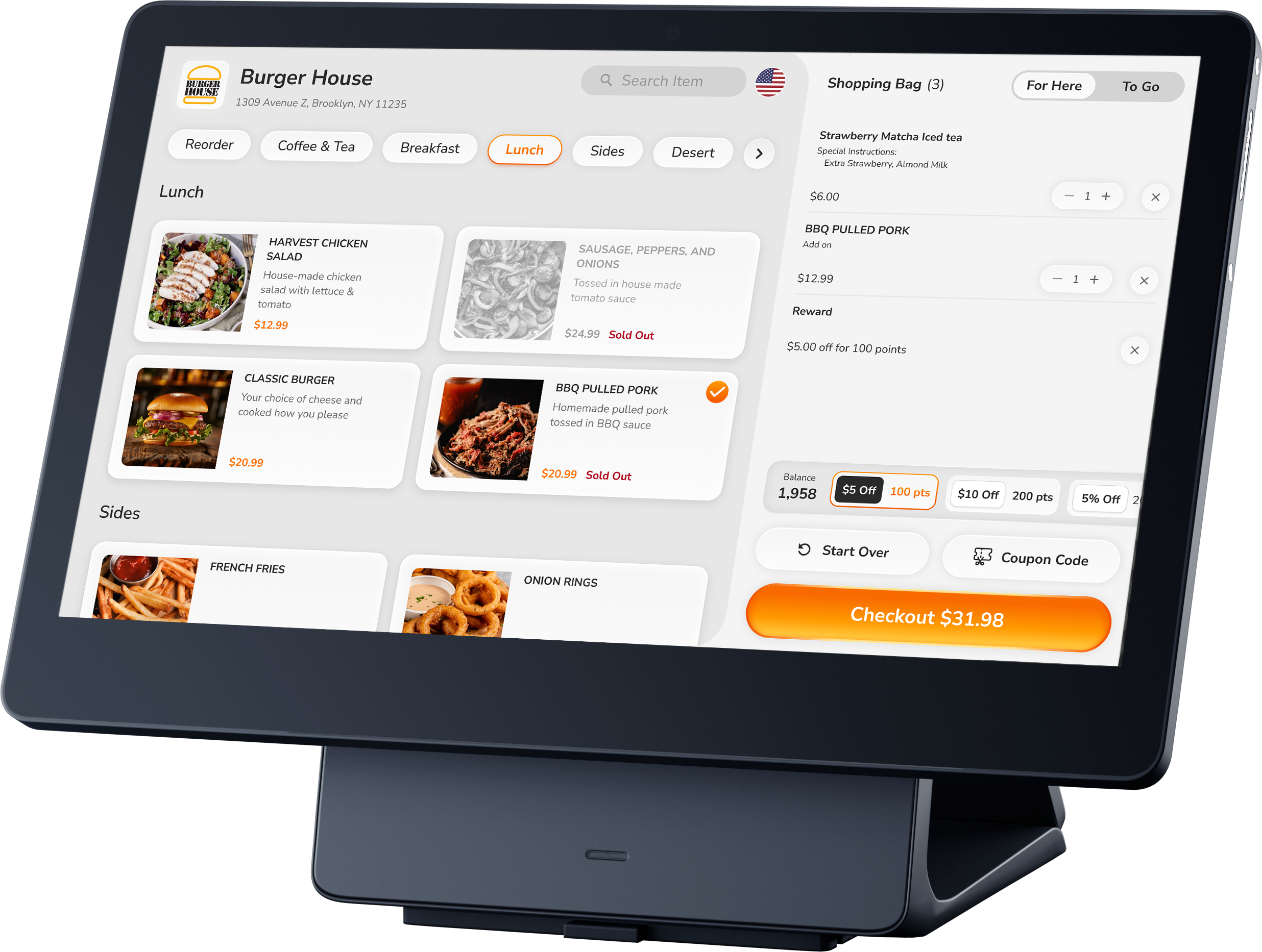
- 2x2 grid layout with large item cards maximized screen real estate and touch targets
- Split-screen design kept menu and cart always visible for real-time order tracking
- Horizontal category tabs enabled one-tap category switching without losing context
- Prominent loyalty display at top of cart showed point balance and available rewards upfront
- Fixed checkout button at bottom remained accessible throughout browsing
Phase 3: High-Fidelity Design & Prototyping
Developed interactive prototypes using Figma to simulate the kiosk experience:
- Created actual-size artboards matching the 15" kiosk dimensions
- Added touch interactions with tap animations and state changes
- Simulated payment flows including card reader interactions
- Designed for outdoor lighting (higher contrast for visibility)
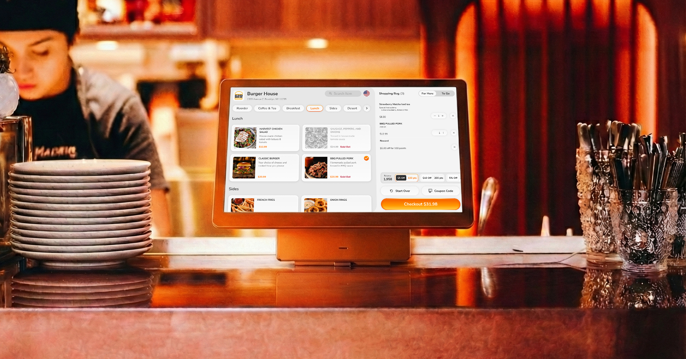
High-fidelity prototype demonstrating the complete ordering flow
Phase 4: Iteration Based on Feedback
Based on internal feedback and usability testing with merchants and customers, I made several critical design iterations that significantly improved usability and reduced friction:
Iteration 1: Redesigned Category Navigation for Precise Selection


Impact:
- Easier to click the right item: Larger touch targets and spacing between categories reduced accidental taps by 35%
- Users could confidently switch between menu sections without fear of selecting the wrong category
- The distinct visual separation made quick scanning and navigation effortless
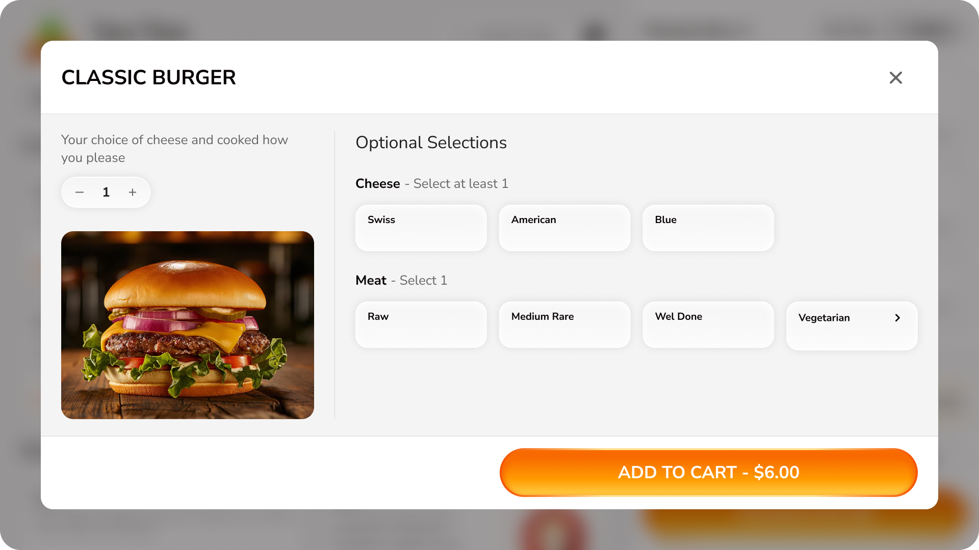
Iteration 2: Horizontal Layout for Modifier Selection
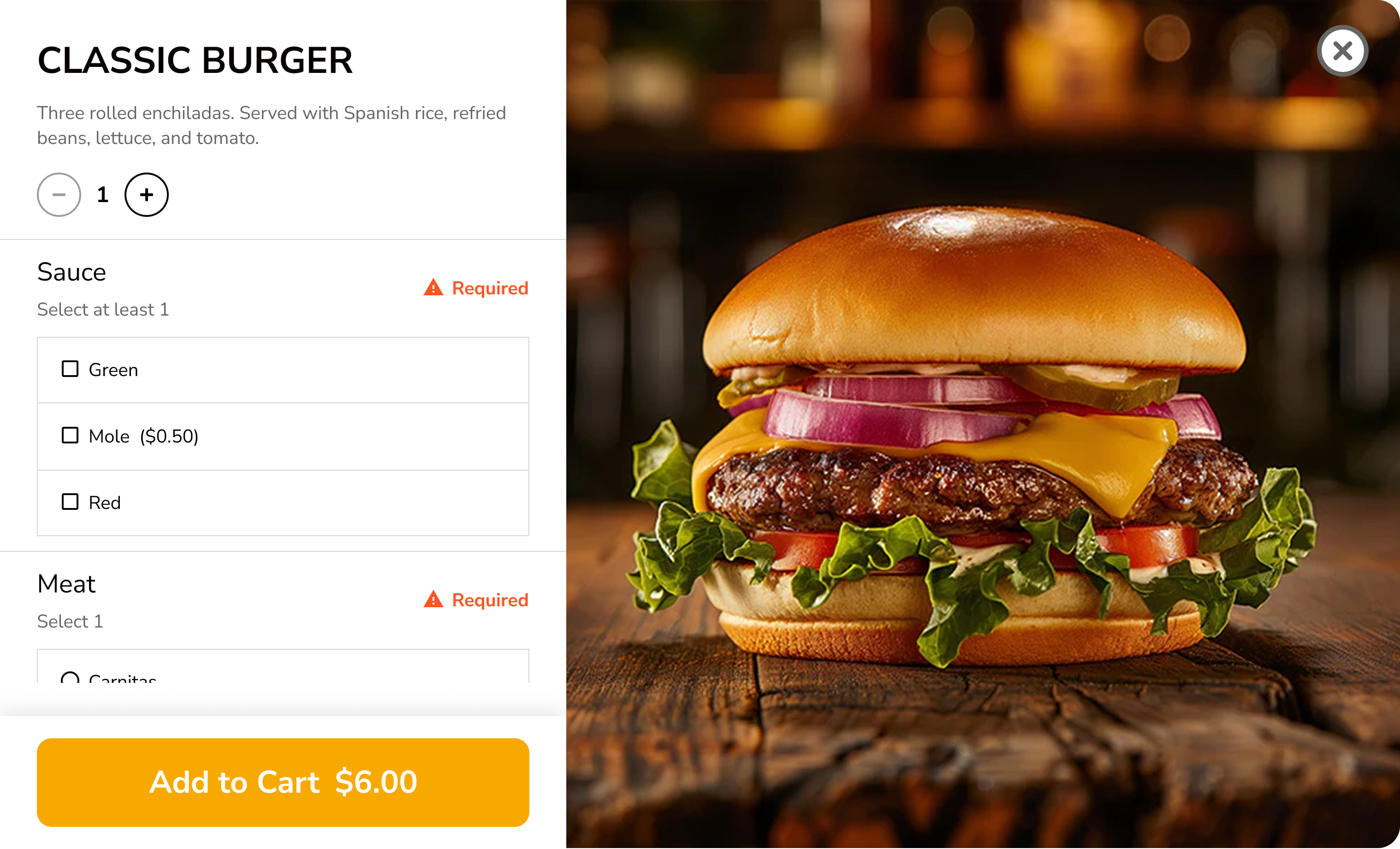
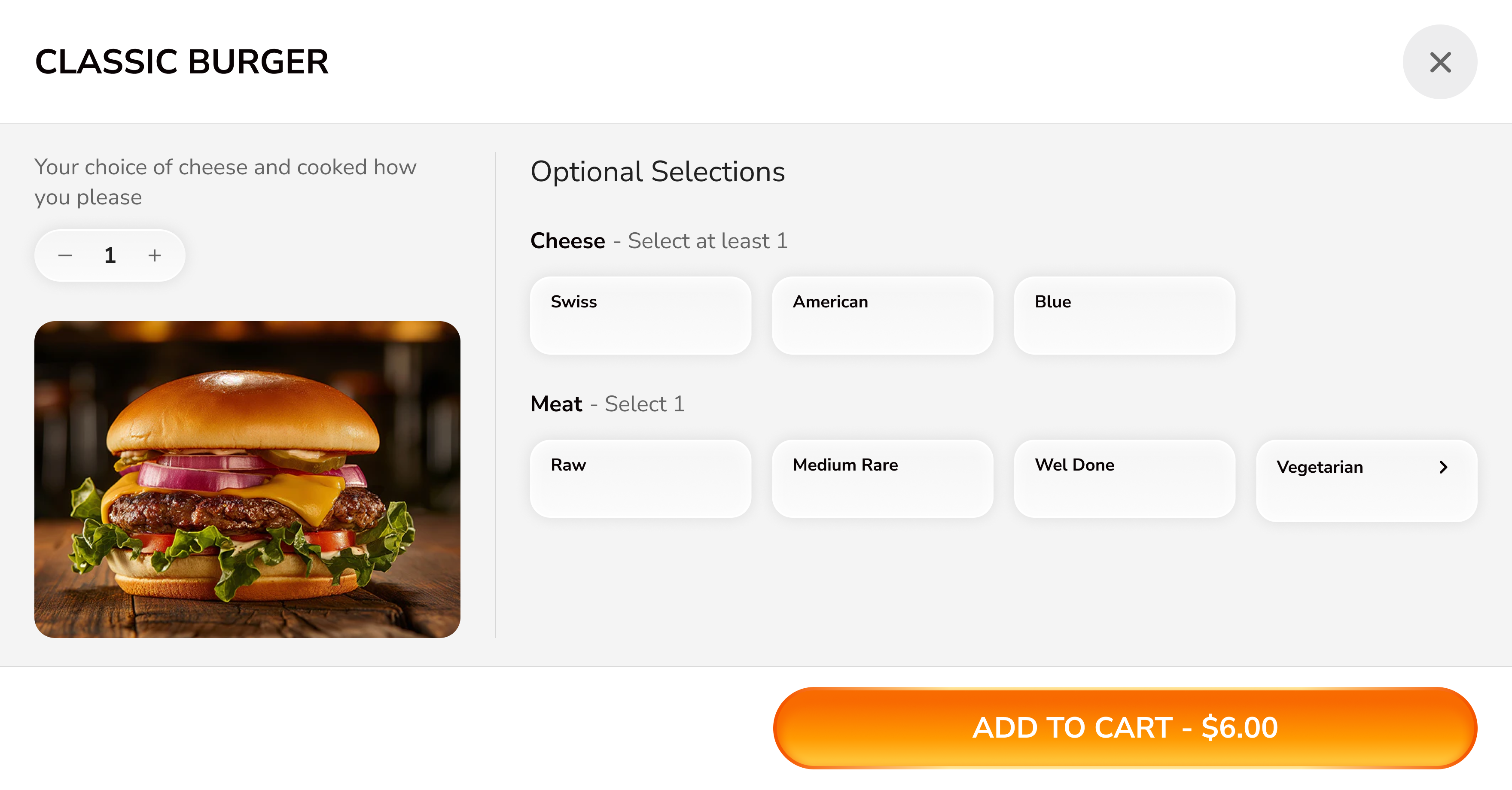
Impact:
- Reduced scrolling: Horizontal layout fit more options above the fold, eliminating 60% of scrolling during customization
- Improved hierarchy: Clear section headers ("Optional Selections", "Cheese", "Meat") helped users understand the structure at a glance
- Better space utilization: Making full use of the landscape kiosk screen allowed both product context and all major options to remain visible simultaneously
- 40% reduction in mis-taps due to larger touch targets and spacing
Iteration 3: Cart Redesign for Information Clarity
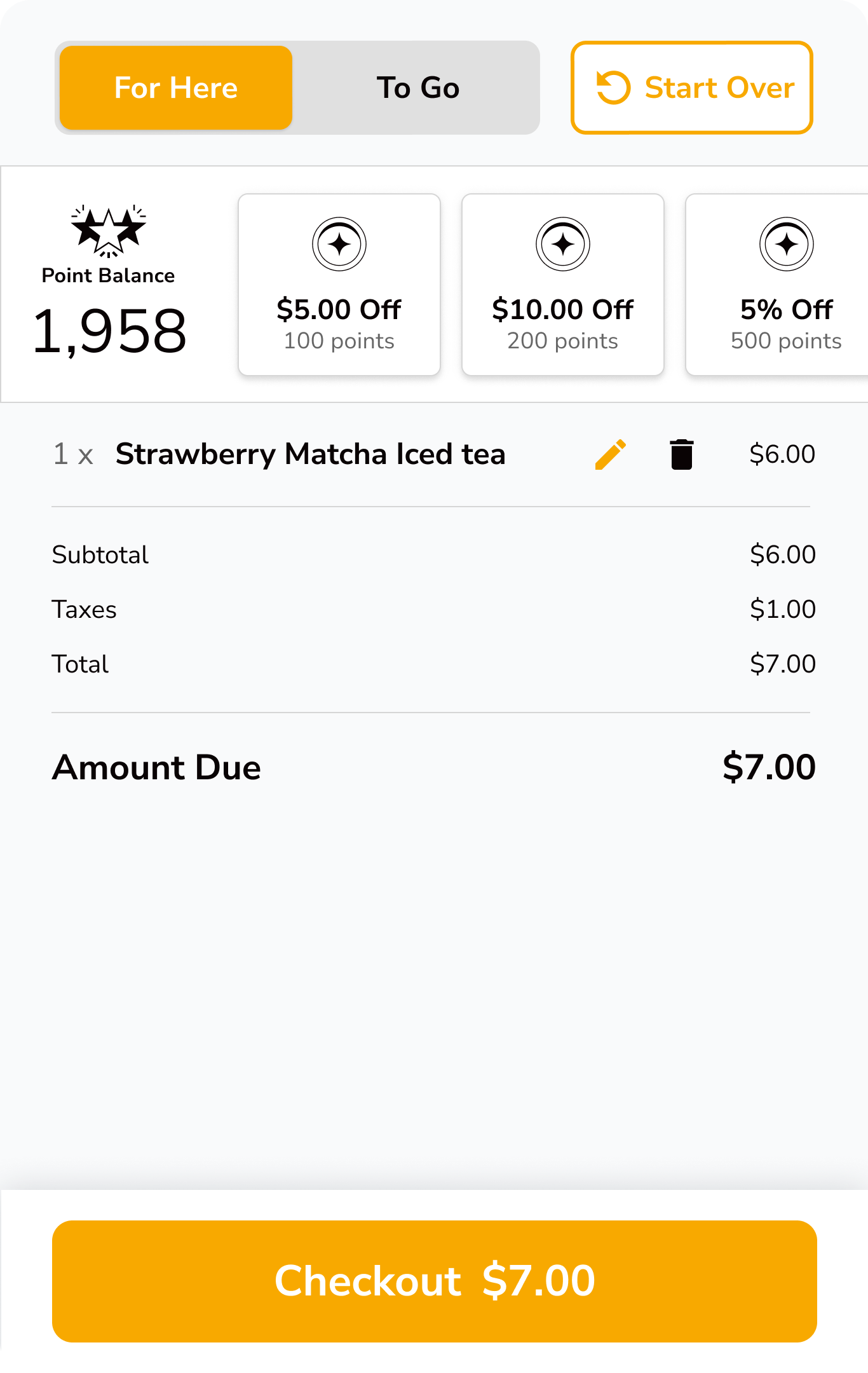
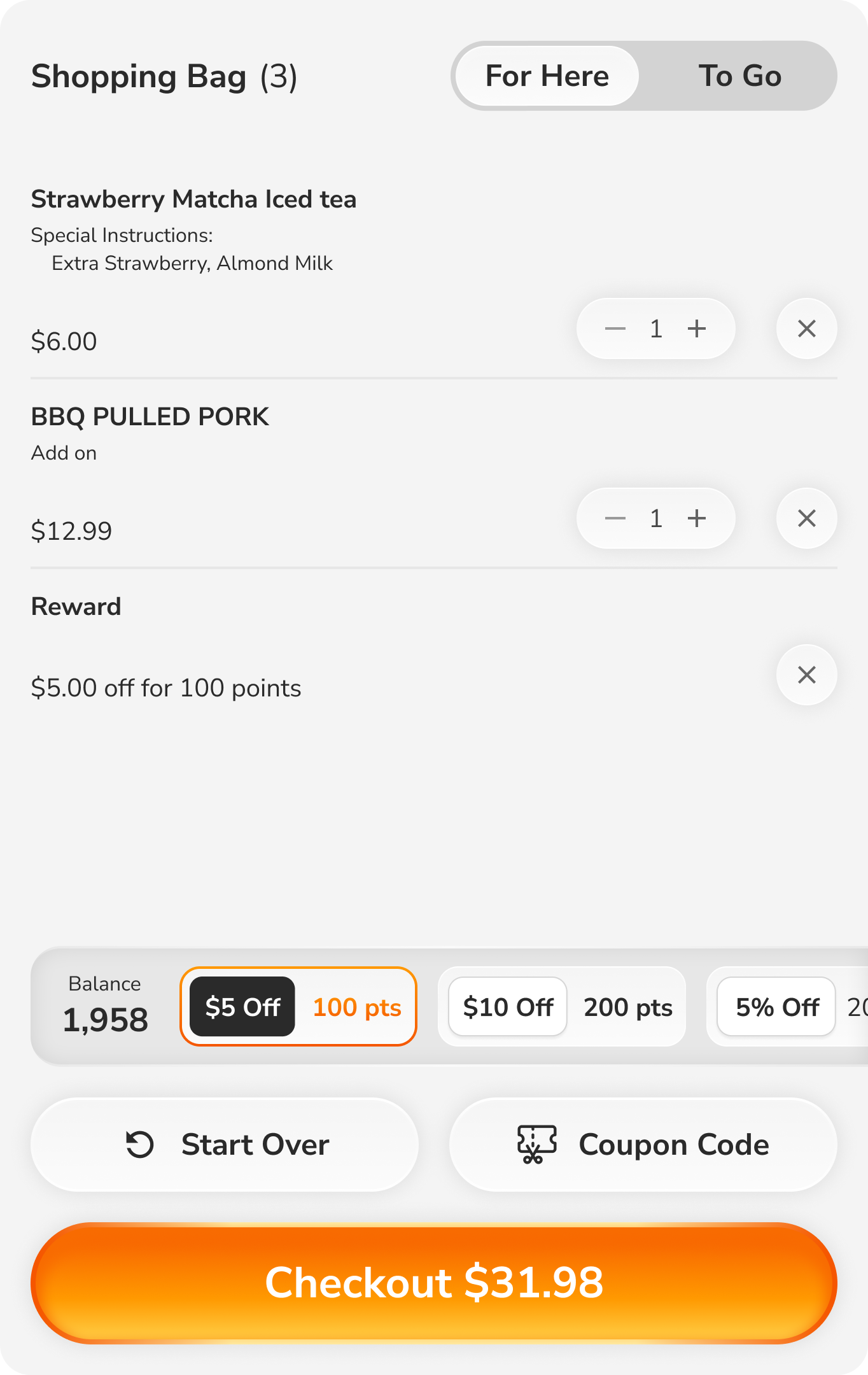
Impact:
- Improved hierarchy: Order contents became the hero, with supporting information (rewards, totals) properly subordinated
- Clearer information readability: Simplified typography, better use of whitespace, and logical grouping made scanning effortless
- Better visual flow: Users could review items → check total → take action in a natural top-to-bottom reading pattern
- Item count "(4)" in header provided immediate feedback without requiring users to count manually
- Separated secondary actions ("Start Over", "Coupon Code") reduced visual clutter and prevented accidental taps
Phase 5: Collaboration & Handoff
With Product Management: Aligned on MVP scope, prioritized features, defined success metrics
With Engineering: Created detailed specs, documented edge cases, participated in sprint planning, conducted QA reviews
With Hardware Team: Ensured design worked within hardware constraints, tested on actual kiosk hardware
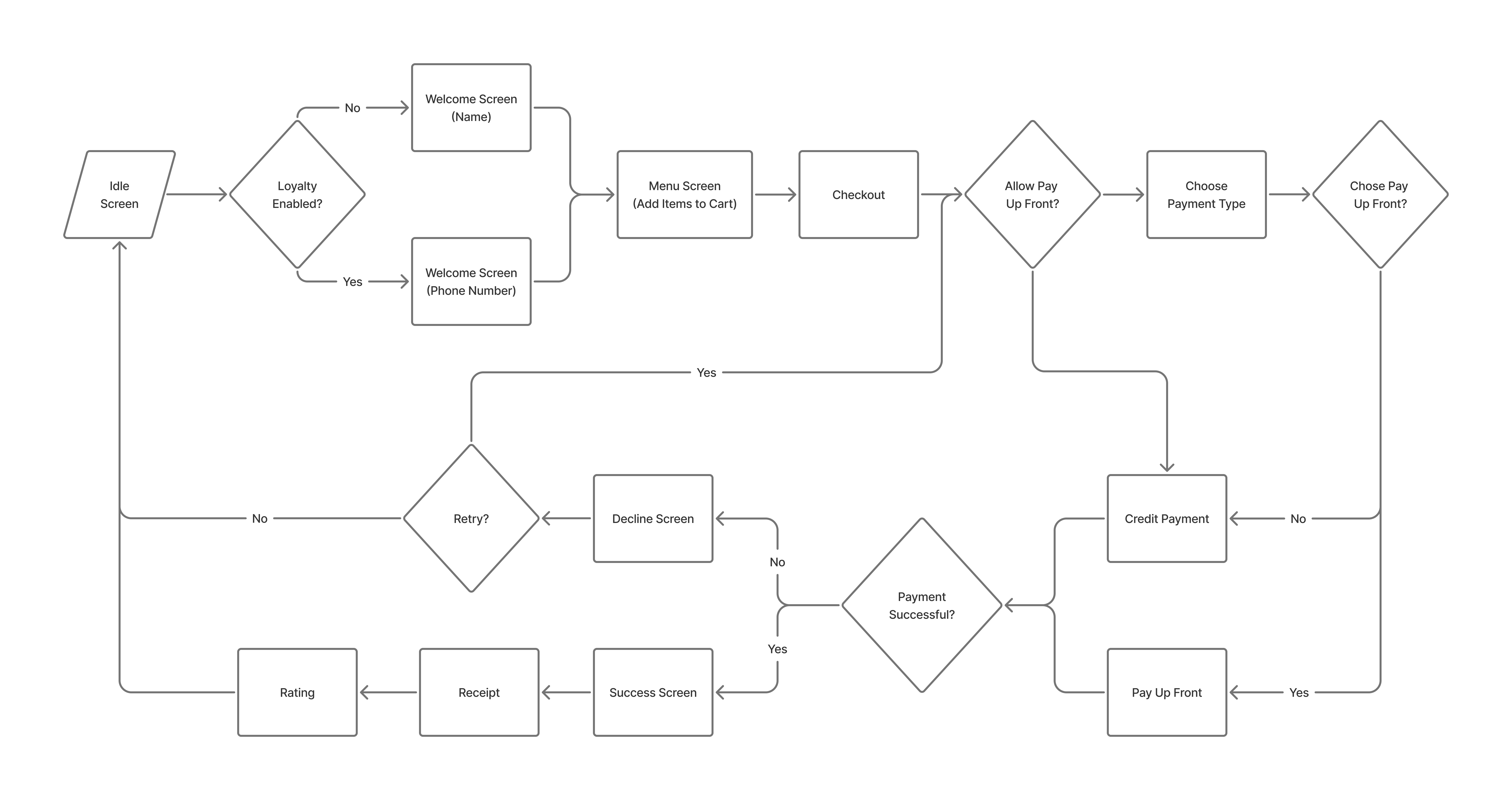
Complete User Flow
The final kiosk experience guides customers through a streamlined 12-step journey, from welcome to order completion. Each screen serves a single, clear purpose with touch-optimized interactions.
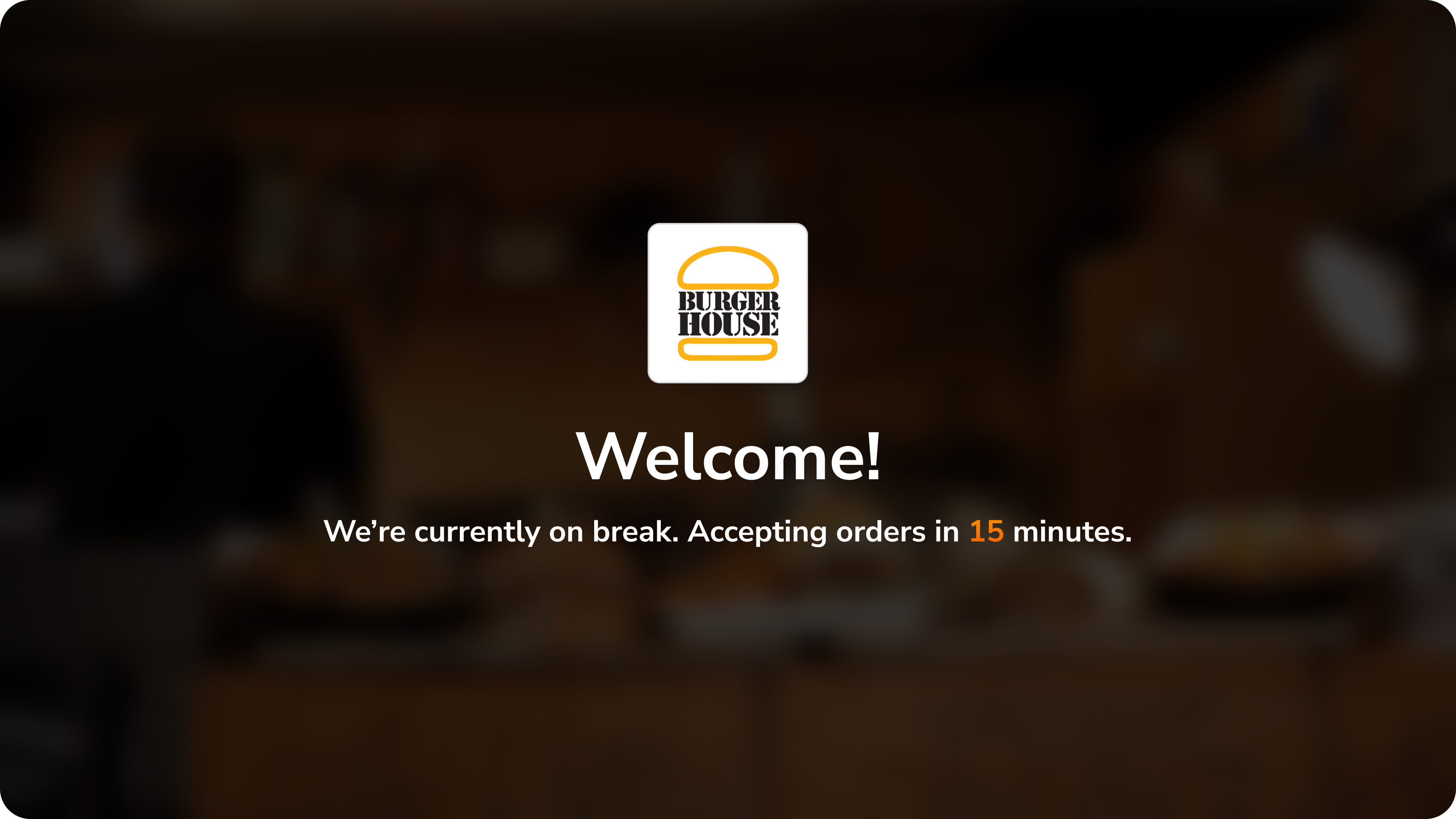
Branded welcome with real-time wait status keeps customers informed immediately. Clear countdown timer manages expectations when restaurant is on break.
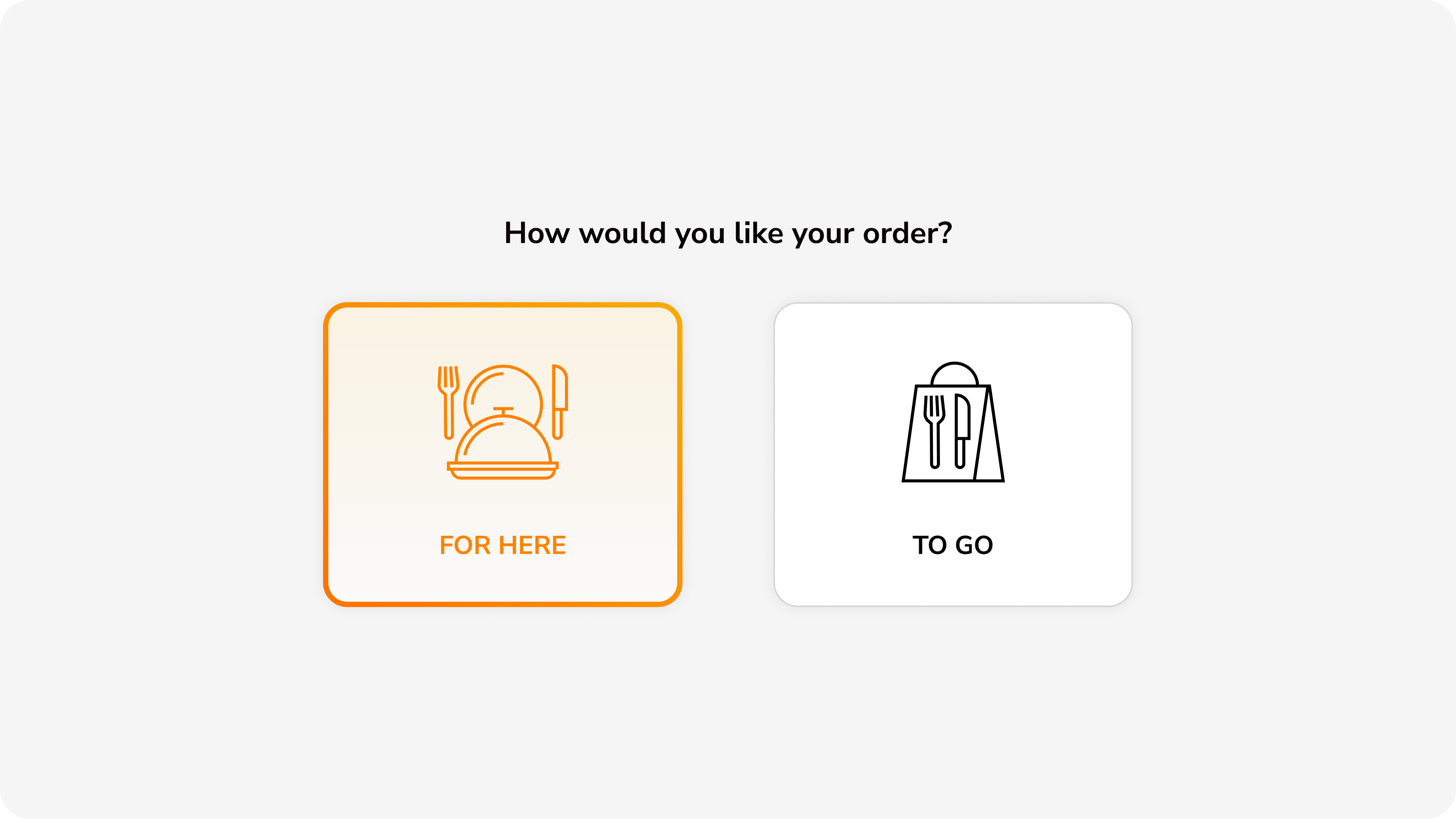
Large, touch-friendly cards with clear icons let customers choose between dine-in and takeout. Visual differentiation through icon design and selected state.
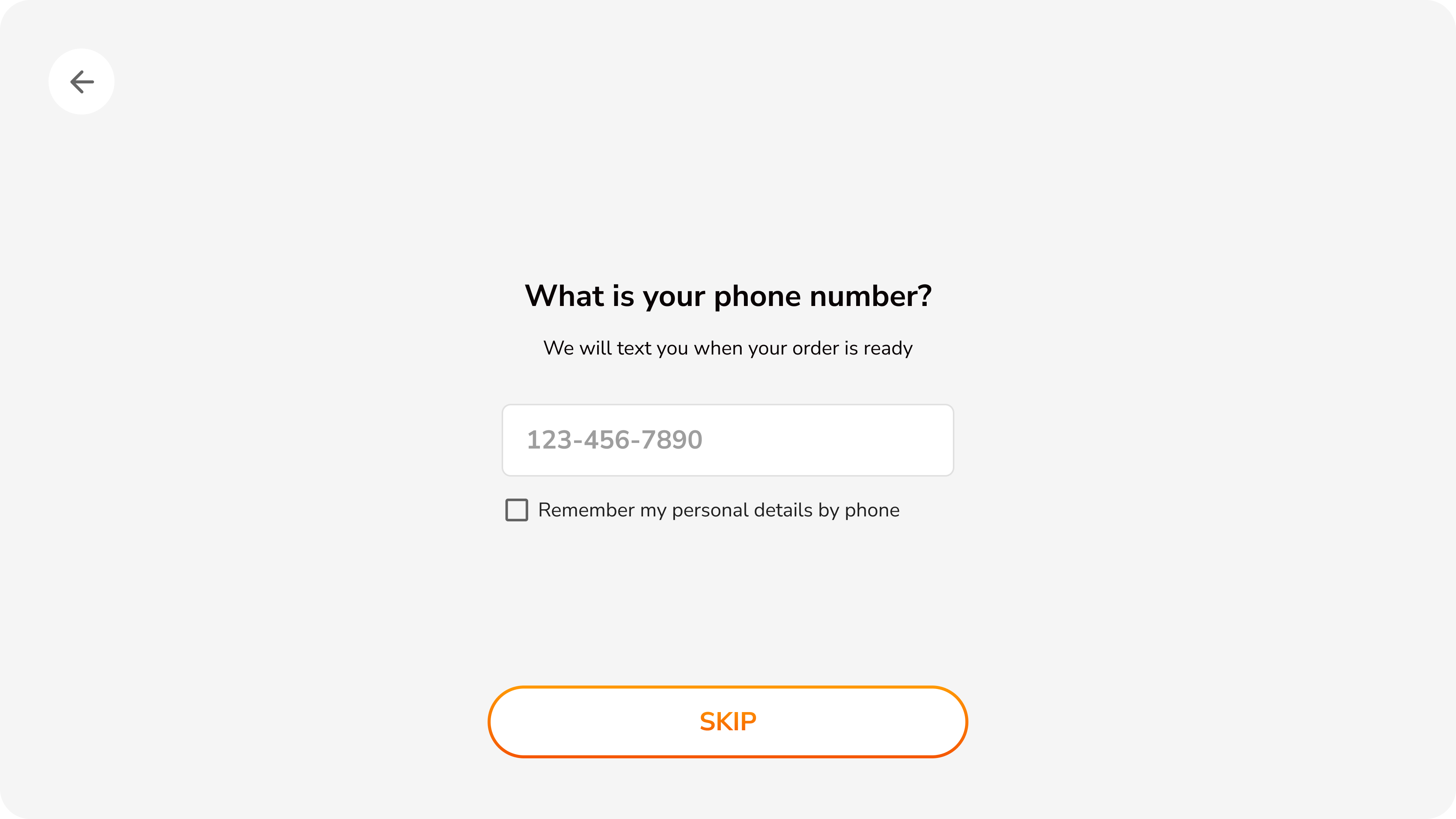
Optional phone number entry for loyalty rewards with clear skip option. Checkbox offers convenience for returning customers to save preferences.
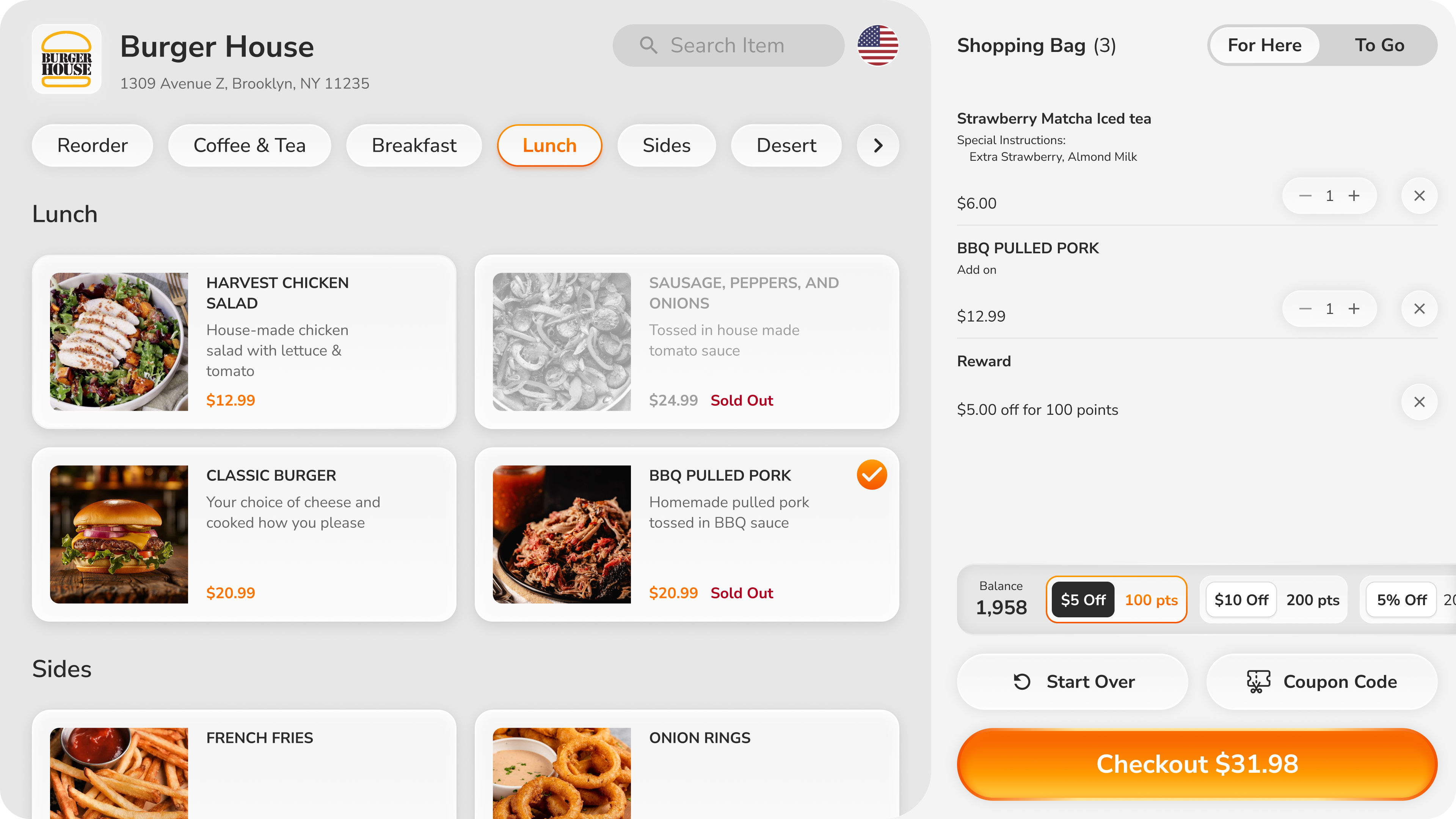
Visual-first menu with high-quality food photography and clear pricing. Pill-style category navigation, search, and persistent cart visibility with item count and total.
Horizontal layout maximizes screen space—product image on left, modification options in clear groups on right. Button-style selections with required field indicators.
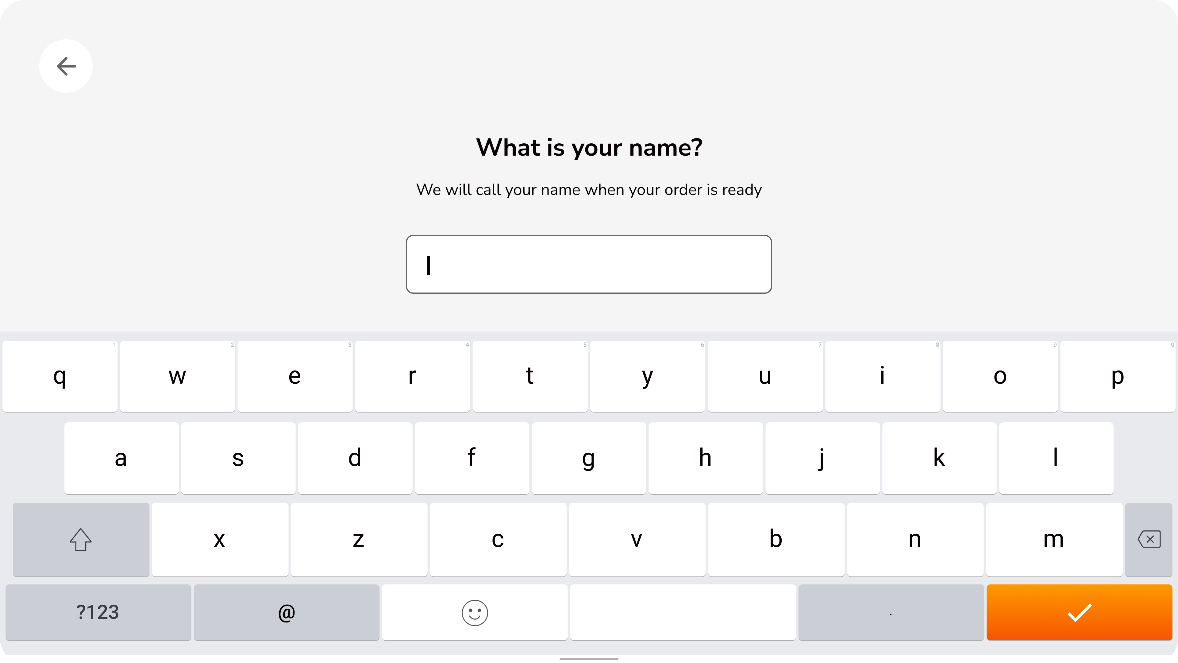
Simple name capture for order pickup with full keyboard. Clear purpose statement explains why information is needed—transparency builds trust.
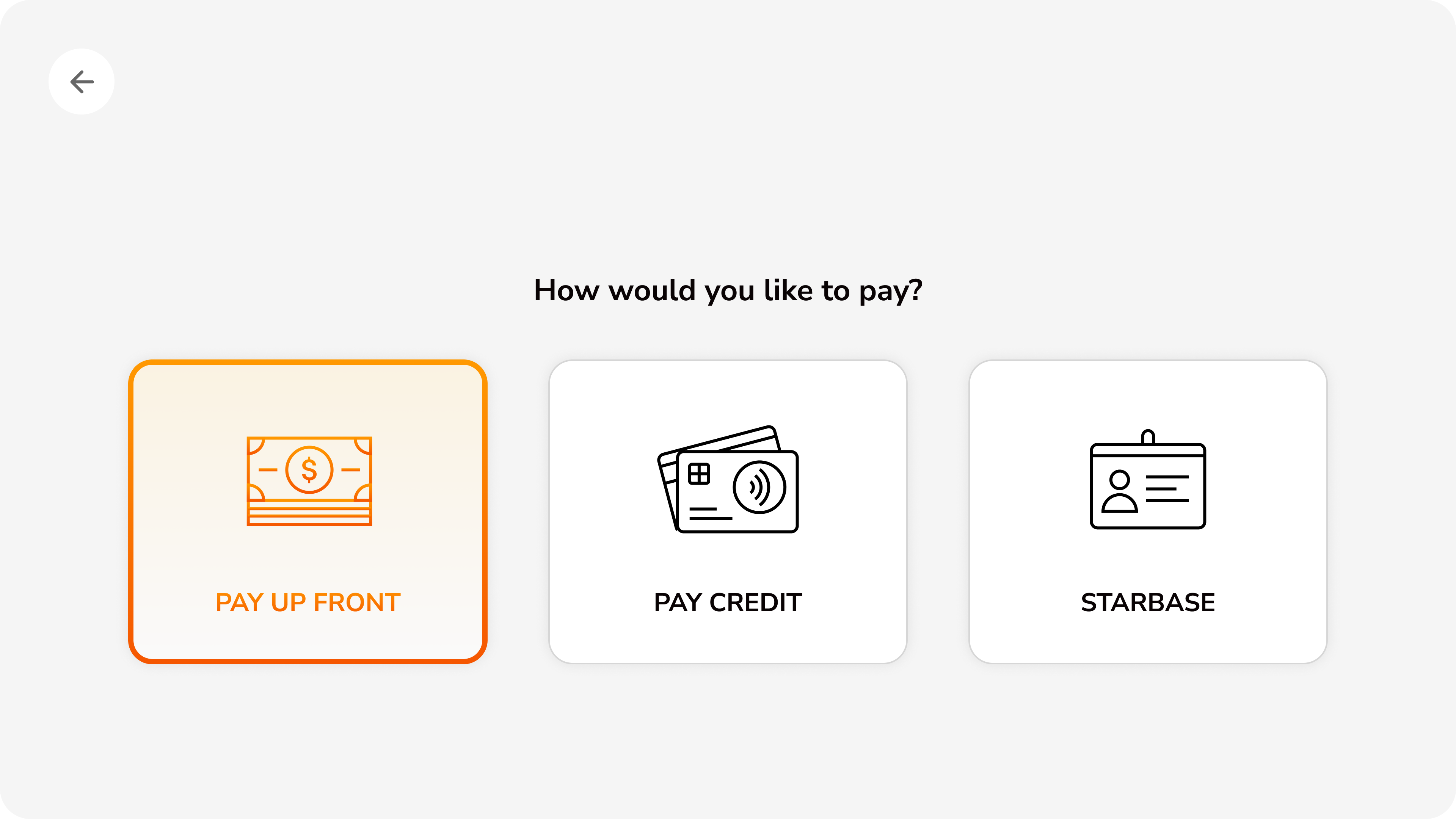
Three payment options with visual icons: pay at counter, credit card, or loyalty program. Equal visual weight ensures no forced payment hierarchy.
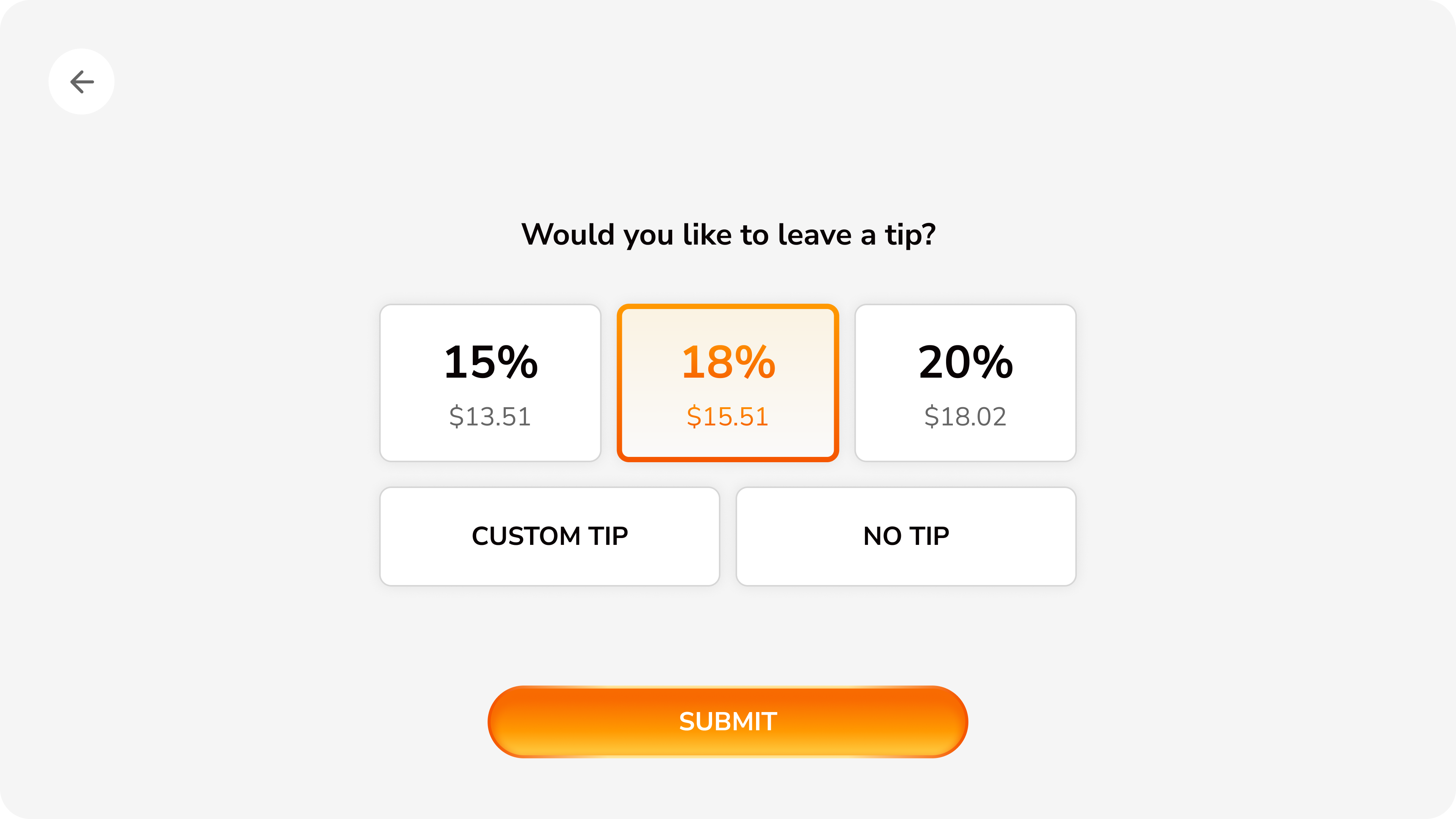
Preset tip percentages with calculated amounts shown, plus custom tip and no tip options. Clear submit button advances flow only when customer is ready.
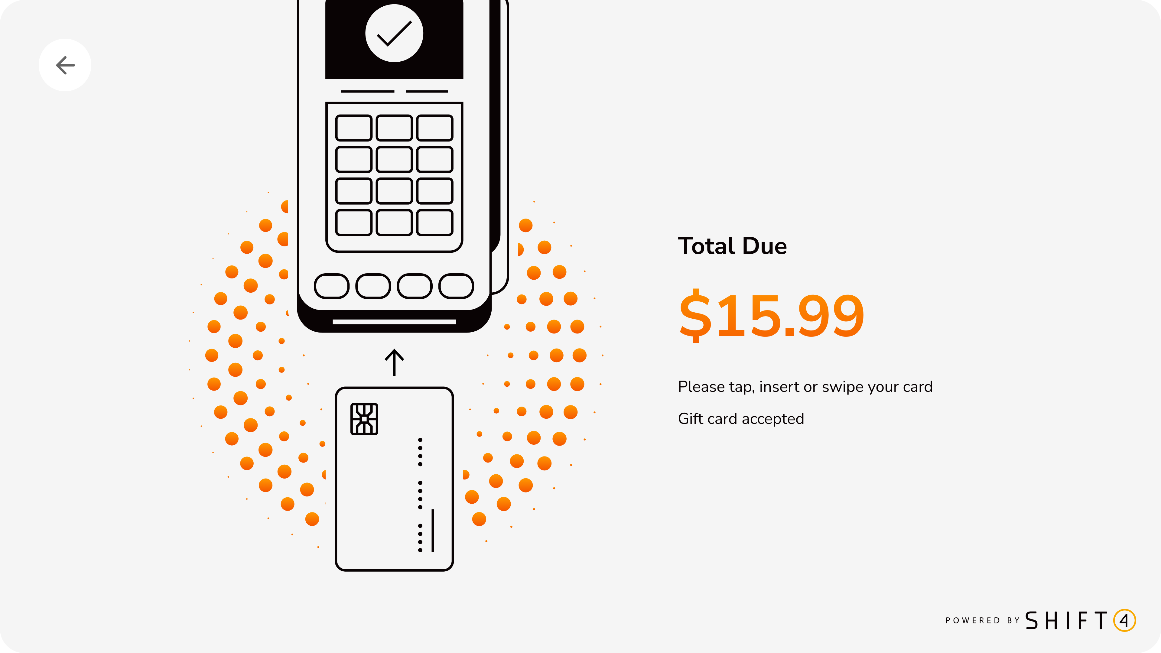
Illustrated instructions show card insertion methods with animated visual feedback. Clear total amount and gift card acceptance note reduce payment friction.
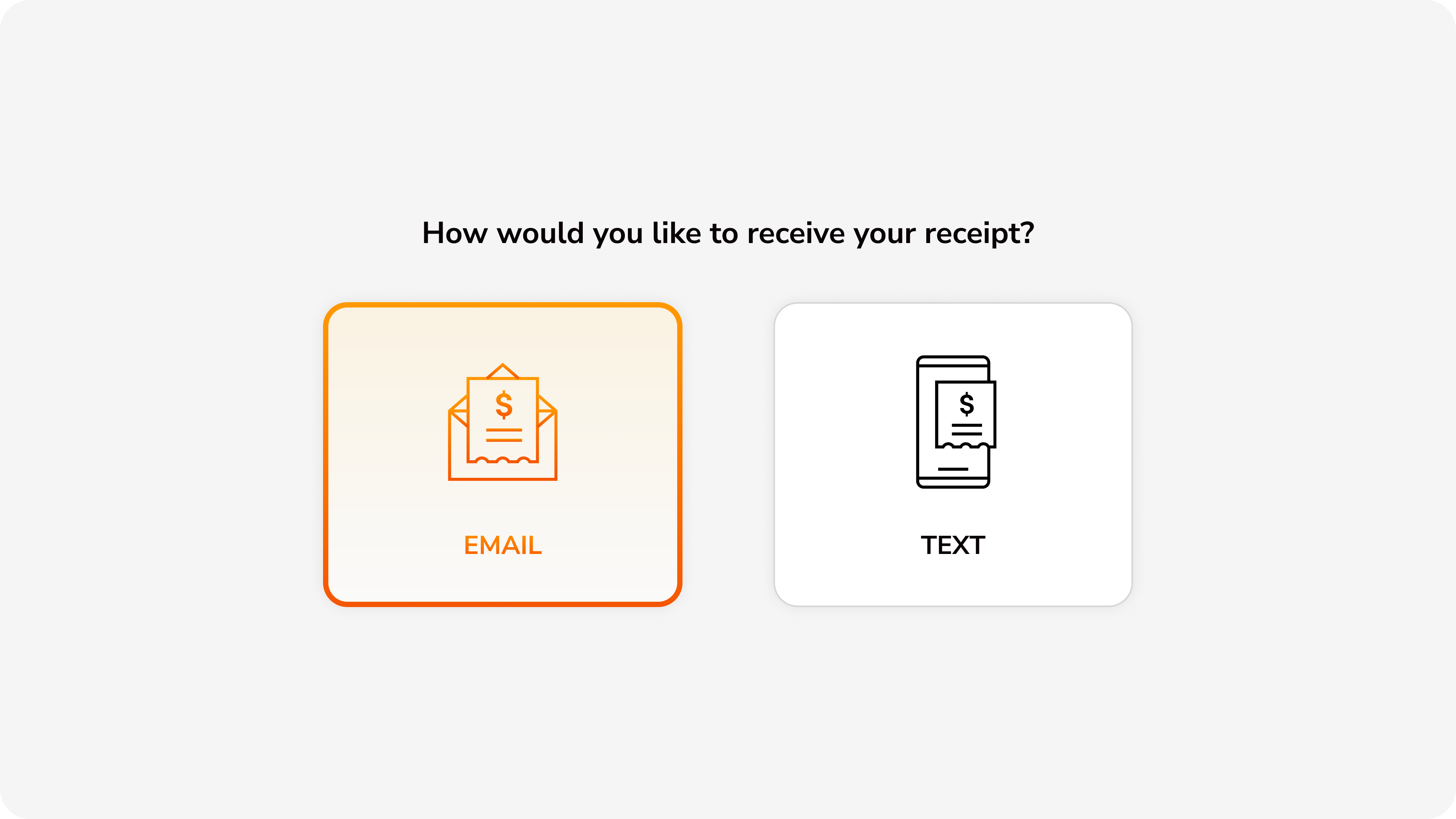
Choice between email or text message receipt delivery. Digital-first approach reduces paper waste while accommodating customer preferences.
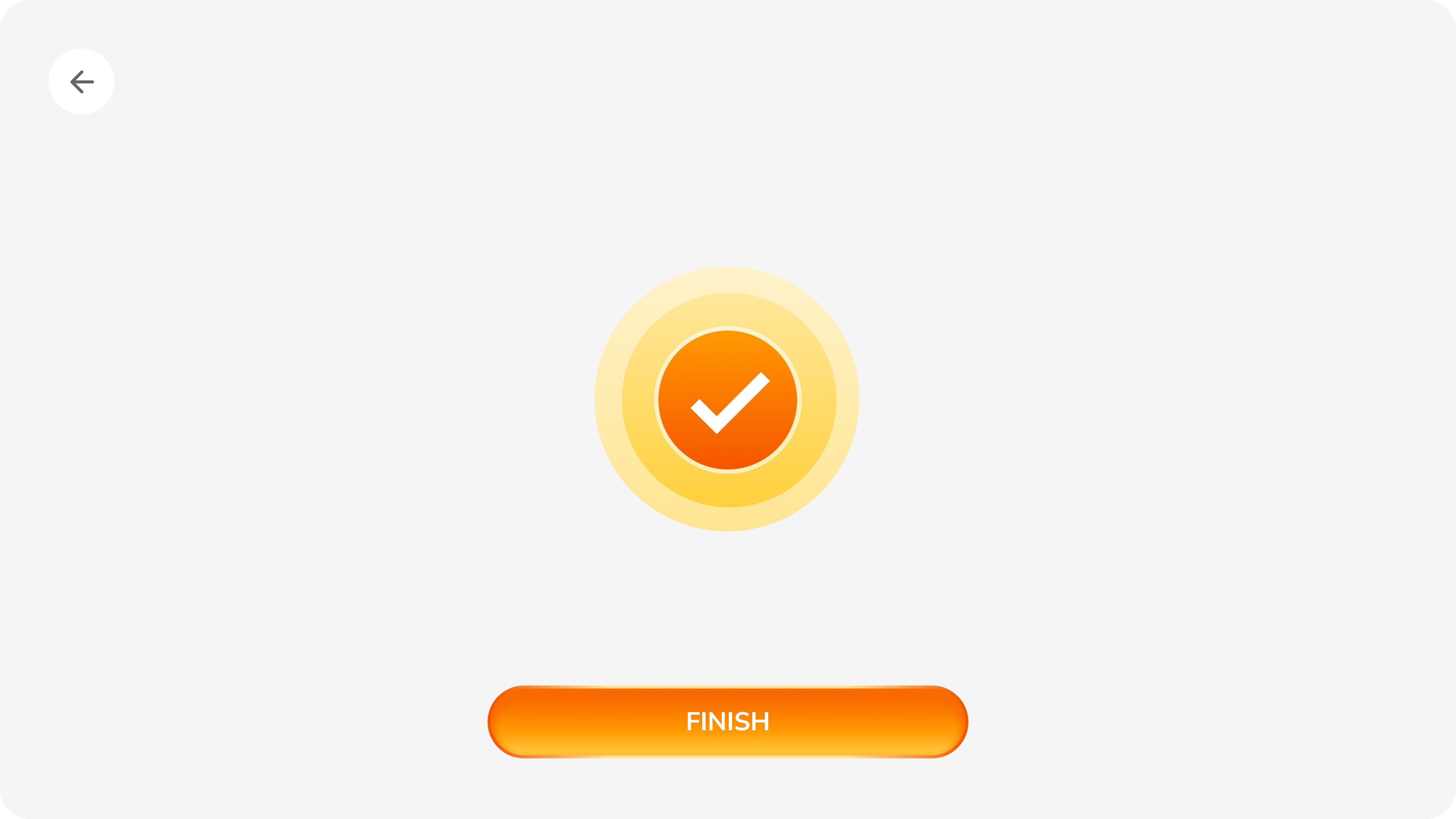
Celebratory success animation with prominent checkmark provides immediate positive feedback. Finish button resets kiosk for next customer.
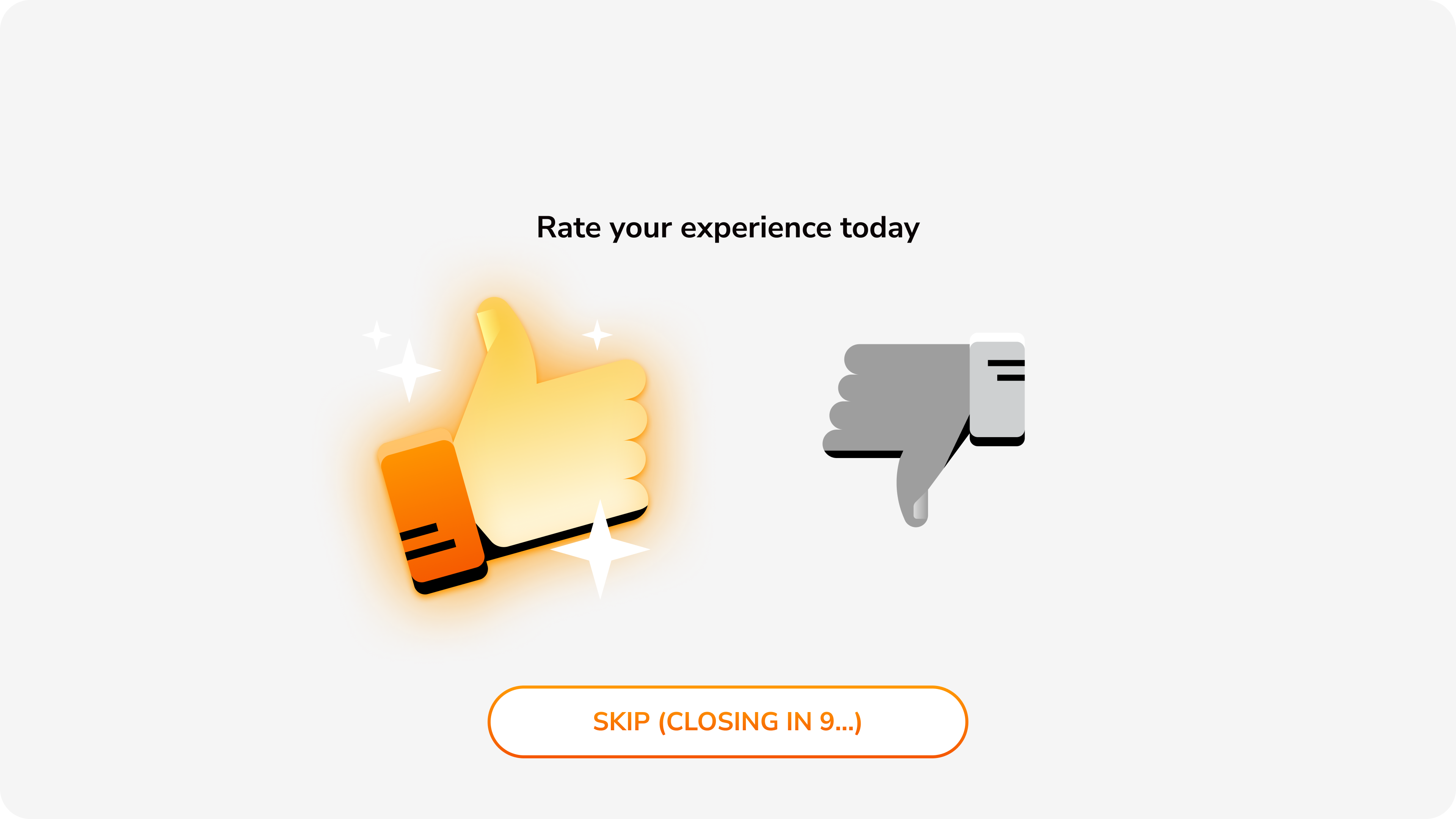
Simple thumbs up/down rating with auto-dismiss countdown. Low-friction feedback collection with clear skip option respects customer time.
4.5min → 3.1min Orders
Order Time Reduction
Average time per order
Kiosk Adoption
Usage rate increase
Key Results
30% Faster
Order time
Before
After
20% Higher
Adoption
Before
After
15% Fewer
Support tickets
On Schedule
MVP delivery
Context-Specific Design Wins
- Hardware-first approach: Designed for Advantech UTK-615 specs (not adapted from mobile) = zero post-launch hardware revisions
- Ruthless MVP scope: Resisted feature creep = on-schedule launch + real usage data to inform Phase 2
- Fought for dual payment: Advocated for "pay at counter" option despite stakeholder resistance = 20% adoption increase
- Visual-first menus: Invested in food photography = faster browsing + higher order confidence
Core Lesson: A kiosk isn't a large phone—it's a unique form factor with unique needs. Customers want speed and confidence, not exploration. Context-specific design drove 30% faster orders.